Our communication objectives for our campaign for Cliffside Restaurant were modernism, simplicity, and approachability. The restaurant itself is very modern, so we wanted the items included in our campaign to be modern and classic as well to match. The decor at Cliffside is not overly extravagant and has a simpleness to it's beauty. All of the items in the campaign, as well as the logo we designed, are simple so it doesn't seem like we are trying as hard. Our last objective was to make the restaurant more approachable. Because it's a fine-dining restaurant, many people think it isn't affordable or that it's too stuffy. By offering more ways for people to hear about the restaurant (ie mailers) Cliffside will begin to be more approachable.
The audience we are trying to reach includes retired couples, young families, and tourists. When we updated the website, Markie included the kids menu so that people would know that it is a family friendly restaurant. The retired couples will appreciate a mailer that has the dinner menu and phone number to make a reservation, as well as a website that is easy to navigate. Tourists will see the catering van while they are driving around town which will peak their interest and get them to the restaurant, as well as seeing the new billboard between St. George and Vegas since a lot of people fly in to the Vegas airport.
Wednesday, December 7, 2016
Monday, December 5, 2016
Cliffside Catering Van Wrap

Having an attractive catering van will be a huge asset for Cliffside. It is another form of advertising that will bring more people into the restaurant, even if they aren't interested in catering necessarily. The van wrap is versatile and with the slight alteration of removing the word "catering" from the hood of the van, this wrap could also be used on a company vehicle driven by the owners or general manager. The restaurant itself has a modern,simple style which is translated through this van wrap. The wrap isn't too busy so drivers won't be distracted or overwhelmed when trying to read it. The orange color of the "Cliff" and phone number make both parts stand out on the side panel. It draws attention to the logo and name of the restaurant and the phone number which is one of the most important parts, so people know how to contact the restaurant.
I am very proud of the outcome of this project. I think the wrap is neat and looks very professional. It remains consistent with Cliffside's style and will be a great addition to the restaurant and marketing aspect.
Monday, November 21, 2016
Cliffside Restaurant
For our team project I talked my group members into taking my work, Cliffside Restaurant, on as a client. Cliffside is a fairly new restaurant in town, only being open for the last 2 years, and has tons of potential and lots of room for improvement.
My contribution to this assignment is going to be designing a wrap for a catering van. Cliffside does some catering, but it isn't something that is being advertised just yet. The owners are wanting to start getting the catering side of business off the ground and the vehicle is an essential starting point. Having an attractive wrap for the van will be a form of advertisement all on it's own. the wrap will include our new and improved logo that is being designed by Anthony, and well as an image of the food, taken by Markee, and contact information to book the restaurant for an event. Being able to offer catering will extend the menu at Cliffside out of the confines of the restaurant walls across Southern Utah and even Nevada.
Personas:
Tom, 65, is one of the owners of Cliffside Restaurant and like any business man he wants to increase his profit. He wants Cliffside to reach "legendary" status here in St. George and wants to be the go to place in this town. Tom wants the word about the restaurant to reach as many people as possible in order to get a wider variety of people up there to eat.
Dorothy, 64, is Tom's wife. While Tom handles the business side of things, Dorothy is mostly invested in the aesthetics of the restaurant and the hospitality. She is the main decorator for the restaurant and always wants the restaurant to be spotless and beautiful. As a mother and a grandmother she is very family oriented, she goes out of her way to make young families and their children feel welcome at the restaurant. Like Tom, she too wants to increase the volume of customers as well as the diversity.
Joshua, 27, is a hard working business man with 3 children who is looking for a change of scenery in his life. He is tired of eating at the same middle to low class restaurants every night due to the fact he doesn't have time to cook while being a single parent. He would love to experience a new upper class restaurant that is family-friendly that he and his children can enjoy.
Leslie, 33, has been traveling to all 50 states with her husband and is looking for places to visit in southern Utah. She enjoys the outdoors and will go anywhere that stands out to her.
Bob, 63, and Susanne, 62, own a second home here in St. George, Utah. Because Bob was able to retire early, the two of them visit on a frequent basis, especially during the winter months. They typically like to treat themselves to a restaurant cooked meal two to three times a week. With many of the restaurants growing old, they are looking for a unique upper class restaurant where they can enjoy a view and each other’s company.
Thursday, November 10, 2016
Mis-en-Scene

The role I chose to evaluate in the movie Interstellar was that of the Art Director. The movie is artistic and very beautiful and I have to applaud the Art Department for what their creativity and imagination. The Art Directors for this movie were Kendelle Elliott, David F. Klassen, Josh Lusby, Eric Sundahl, and Dean Wolcott. Kendelle Elliott also did the art direction for the movie The Cabin in the Woods. David Klassen worked on Django Unchained, as well as both Iron Man and Iron Man 2. Josh Lusby worked on American Sniper. Eric Sundahl is known for his art direction for 2 of the Pirates of the Caribbean films, "Dead Man's Chest" and "At World's End". Dean Wolcott did such movies as X-Men 2, Ant-Man, and Divergent. All of these Art Directors have excellent resumes and worked together to make Interstellar one of the best Sci-Fi movies of it's time.
The Art Directors work with the Production Designers to make sure that the vision of the Production Designer is being translated into the film. The work with the sets and locations which is crucial to the uniqueness of the film. Once the script is made for a film, the Art Director goes through and organizes each scene and what props or other scene requirements. Art Directors have to handle the Art Departments budget, and manage the schedule of when things need to be done.
The scene our group chose to analyze from Interstellar was the "Tesseract Scene" which is one of the last scenes of the movie when Cooper (Matthew McConaughey) falls through the black hole and ends up in a tesseract where he is in an alternate dimension and is able to communicate with his young daughter through her bookshelf. To my surprise, very little CGI, if not none at all was used in the scene, and that Nolan and his crew, including the art director/art department, built it.

Christopher Nolan and the Art Department worked together with one of the top astrophysicists, Kip Thorne, to make this movie, and this scene in particular, scientifically accurate. The black hole at the beginning of this scene was a 3-dimensional sphere, which Thorne says is more accurate than the breach in space all other films used.
During the tesseract scene there are a few gestalt principles that are noticed. The first is the Law of Continuity. While McConaughey is falling through the black hole and into the tesseract there are many lines coming from the light through all the bookshelves that keep repeating themselves in other dimensions. The Law of Continuity states that our eyes follow lines in the path of least resistance. The other gestalt principle is the Law of Similarity. Even though this scene can be very confusing and hard to follow exactly what's going on, we are able to figure out that what we are seeing is the daughter's room repeated thousands of times because we group together the similarity of the bedrooms and bookshelves that all look exactly the same.We group them together to understand the different bedrooms in the different dimensions. Figure/Ground relationships also exist in this scene because in order to portray the McConaughey is falling we see the light from the starts and the tesseract coming from the background into the foreground. One good example from this in the scene is when McConaughey sees his daughter walking across her bedroom floor and beneath her is the same scene happening below and keeps repeating itself.
Thursday, October 20, 2016
Compose Your Frame

I took this picture at my work, Cliffside Restaurant. We have these hanging light bulb light fixtures throughout the restaurant. I climbed on top of a barrier between the dining room and the kitchen in order to capture the picture from this angle. The different composition aspects I was able to incorporate were:
Rule of thirds: I positioned the light bulbs using the rule of thirds, putting them in the upper left hand corner of the frame to draw the attention to them and make them the focal point of the shot.
Diagonal rule: The windows are arranged in a diagonal, ascending upwards. This diagonal separates the ceiling/wall from the windows almost making it look like two different pictures were sliced in half then combined.
Vector: The light bulbs are hanging down which creates direction downward.
Lines: There are lines created by the window panes, both horizontal and vertical. The horizontal line is much thicker than the three vertical ones.
Figure/ground: The light bulbs are in the foreground drawing attention to them first, and also making them seem larger than they actually are. The view from the windows, as well as the window panes and wall are in the background.
Contrast: There is contrast between light and dark in this frame. The wall and the window panes are a dark black that contrasts the bright blue sky and bright orange from the light bulbs. The brightness from the blue sky highlights the light bulb's edges giving them shape against the black wall.
Tuesday, September 20, 2016
Good design/Bad design
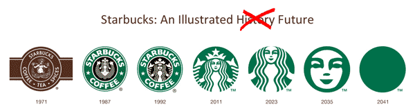
I am going to be evaluating the progression of the Starbucks Logo.
1971- The first logo that Starbucks came up with was too detailed without enough clarity. From up close you can make out the Greek Goddess but from afar it's hard to tell what you're really looking at. The goddess is also topless, so it was inevitable that she would need to be covered once their chain branched out to be more conservative. It also displays the words "coffee", "tea", and "spices".
1987-The next logo they produce was more simple, just having the words "Starbucks" and "coffee" and the goddess is less realistic. The logo went from brown to green with a black center. The logo has more contrast between the white, green, and black, and it is easier to see the woman in the middle. This logo makes me a bit uncomfortable the way the goddess in the middle is spreading her fin-legs, once again a little sexual.
1992-As time goes on, the logo gets more simple, and less sexual. The next logo zoomed in more on the goddess's face, so you can only see her fins on the side. This logo still has "Starbucks Coffee" on it.
2011-The current logo no longer displays Starbucks' name. It is zoomed even closer up to the woman and is only green. This logo is the best logo because it is simple, like a logo should be, and it is more conservative to protect Starbucks from any issues among conservative communities.
Although the colors have changed, I like that Starbucks has kept the same Greek goddess and the focal point of every logo, making an identity for themselves, and the consistency makes them recognizable.
Thursday, September 8, 2016
Contrast, Balance, and Harmony
This image is a picture I took this summer when I was in Cannon Beach, OR on my brother's iPhone 4. My older brother, pictured, has studied karate and other fighting types for many years and he was doing a flying kick that you might see in a Jet Li movie. It took several attempts to time the picture just right so he was suspended in the air, but I finally got it right before he ran out of breath. The massive rock in the background to the left is Haystack Rock which is right on Cannon Beach.
Contrast: There is a lot of contrast in this image. My brother's silhouette is contrasted against the bright sun which was setting at the time behind him. The sun's glare off of the wet sand also contrasts Haystack Rock, as well as the dark sand, ocean, and sky surrounding it. My brother looks massive compared to the 3 other people in the background taking pictures and because they are all only silhouettes it is an illusion because we can not tell the depth which they are apart.
Balance: Although this image is asymmetrical, the balance comes from my brothers positioning in the air. He explained to me, in length, how difficult this kick is to execute because each part of the body has to be perfectly in place for it to work. His right foot had to be tightly tucked underneath his left. The right arm had to be at an angle while the left arm and leg are straight and parallel to one another. It seems even more challenging when you think about how all these movements have to happen in less than a second while he was at the peak of him jump before he landed. Although his body is asymmetrical, you can see he is balanced in the air because his body is parallel to the sand below him.
Harmony: This image is harmonious because of all of the contrast and the form of my brother's body, as well as the context. Cannon Beach is a harmonious place for me. I've been there a few times, the first two when I was a little girl, and the most recent time was this summer, and 10 years had past since the last time. I remember visiting Haystack rock when I was younger and being in awe at the massive size of the rock and all the tide pools around it filled with starfish and other sea creatures. Those are very happy memories for me. The beach is my happy place. Because his body is so dark in contrast to the bright sun, the focus is on him form instead of any other distracting pieces of clothing or his facial expression.
I thought I'd also include this picture because this was my weak attempt at imitating him. It was a lot harder than it looked apparently.

Monday, August 29, 2016
Visceral Response

This is Cage the Elephant's album artwork for their most recent album, "Tell Me I'm Pretty". I chose this image not only because I love this album, but because it is confusing, beautiful, mysterious, and most importantly, STUPIFYING. When I look at this image is causes a flutter in my stomach, like how Seymour described his reaction to the watch in his TedTalk. The contrast from the pale border containing the artist and album name that surrounds the image, to the dark, cool image really draws the eye to the girl at the center of the image. Because the background is so blurred it leaves a lot of questions unanswered. What is she doing? Is she in a pool? Why is her hair wet? What is in the background?
There are mainly horizontal lines in the image of this girl in the background which causes some vibration and confusion when looking at this image. The negative space is found primarily around the border of the album, and the positive space is the artist name, Cage The Elephant, and the album title, "Tell Me I'm Pretty". The focus is clearly being drawn to the female in this picture because she is the only clear part of the picture.
My favorite part about this image is the color scheme. The colors in the image are dark and cool. The colors literally make me feel colder. The color of her eyes match the color of the icy turquoise (assumed) water in the background. Her lips are also the same hue and value as her hair which is a deep red. Her facial expression is sort of creepy to me because it's really not an expression at all, she looks lifeless. The strap of the tank top she is wearing is an intense white that almost burns the eyes when next to the dark dull colors of the rest of the image.
When analyzing this artwork I started to think why the album designer would use this image for the album title "Tell Me I'm Pretty". The girl obviously looks very natural and doesn't look like she is wearing make-up. Her hair isn't done, it's wet and slicked back. Her complexion isn't perfect, it's red and blotchy, but for some reason I would still consider this woman to be beautiful. During his TedTalk, Richard Seymour makes the statement that beauty is a result of facial symmetry. The woman in this image doesn't seem to have perfect facial symmetry, however she is still beautiful.
The woman in this photo is actually a model named Rachel Sykes. The lead singer of the band, Matt Schultz, carefully selected her to be the model for their album artwork, and she was chosen because of her honest beauty and transparency. He wanted someone that was beautiful but that also looked like they had been through life and had some ruggedness that would be relatable to the album's music. Sykes normally has a very bubbly personality but in this photo it is disquised just as the photographer, Ira Chernova, had intended.
There is much mystery in this album artwork which makes it interesting and different, and stupifying to me.
Subscribe to:
Posts (Atom)